Tuesday, December 4, 2007
2 ethics
Should a photojournalists ethics be absolute or situational? Why?
A photojouralists ethics should be absolute and extrememly specific because judgement changes from person to person and it only make it that much more difficult for an ethical photograph to be printed if ethics are situational.
Can a photo really capture truth? Why or why not?
A photograph can never really capture a true moment. Only by personally experiencing something can a moment be optimally true.
What decisions have you made as a photographer that "edit" reality? Explain.
I have edited the contrast, exposure and sharpness of my photograph.
Why is it important that news organizations have clearly defined ethical standards?
It is important because people think differently and what might seem okay to one person might seem completly wrong to another.
Fashion ethics
List the changes that were made to the model's face in the computer.
Her neck was made longer, eyes made bigger lips made a bit thinner, earlobes were fixed, neck made less thick, eyes moved down a bit from her forehead.
In your opinion, explain if you think it is ethically ok to change a person's appearance like this in a photo.
It is not ethically okay to change a person this drasticly because no human being could ever naturally look that way.
Under what circumstances is it worse than others?
All circumstances should be treated equally
What types of changes are ok, and what aren't?
I don't belive that any changes are okay
Explain what you think the differences are between fashion photography and photojournalism.
Fashion photography is about making models look flawless and 'beautiful' photojournalism is about printing the truth.
What relationship does each have to reality, and how does this affect the ethics of each.
The ethics of fashion photography are different from those of photojournalism becasuse fashion is about artificial perfection.
Wednesday, November 28, 2007
Ethics Intro

I believe that this is the most unethical example of manipulation because the image is illustrating something that never took place. Something as serious as politics should never be messed with.

Tuesday, November 13, 2007
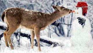 Bambam the deer sneaks up on the snowman as takes a chomp out of the carrot nose. Little did Bambam know the carrot was filled with explosives and Bambam was rushed to the hsopital.
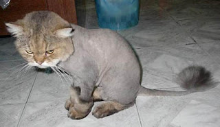 Chester glares at the floor in embarrassment after his owners shave his hair to resemble a lion. They figured he would be perfect for the role of Simba in the upcoming Lion King movie.
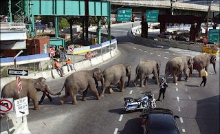 Elephants stomp in unison through downtown San Fransisco. They refused to perform for mere peanuts and decided to run away to LA where elephants were rewarded with four course meals.
Monday, November 5, 2007
repetition
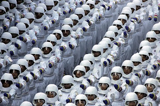 Friday, August 31, 2007-Ready for the Future-Malaysians in costume march in a parade commemorating 50 years of independence in Kuala Lumpur.
 The uniform helmets of the people in costume create diagonals that lead from the bottom left corner of the frame to the top right corner.
 Wednesday, October 10, 2007-Big Stretch-Children practice splits at the Li Xiaoshuang Gymnastics School in Xiantao, China. More than 60 children aged between 3 and 10 from all over China train at the boarding school.
A symetric pattern is created by the legs around the blue mat.
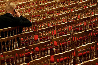
Wednesday, October 3, 2007-Is This Seat Taken?-A deputy waits before French President Nicolas Sarkozy's speech to members of the ruling party UMP (Union for a Popular Movement) at the Elysée Palace.
The lines that are created by the backs of the chairs lead the eye directly to the man in the suit.
Thursday, November 1, 2007
mulitmedia
Melanie Burford does an amazing job in capturing the true and candid emotion of the people of Sugar Hill. She takes the time to get to know these people and becomes part of their everyday life.
B. What was the effect (added power or meaning) of the multimedia effects of the slide show.
Through her photographs, Melanie Buford tries to get people to see what is really going on in parts of this country. She reveals the unfortunate truth about the lives of communities in Sugar Hill.
3 . Explore the page including the map, videos and the other features. What is the most interesting multimedia effect? Post your answer on your blog.
I believe that the most interesting multimedia effect is the police videos. They show you a glimpse of violence in the Sugar Hill community and they put you in an everyday situation for a person living in this area.
Tuesday, October 30, 2007
Tuesday, October 23, 2007
1st assigment
2. I thought about the exposure the most because the lights inside the building were really dim and i had to make sure to not let the shutter speed get under 60. I had it on automatic while i was outside and i made sure that i forced it to 60 if the light was too dim inside.
3. I tried my best to create a frame in some of the photographs and also tried to create dynamic lines. I sometimes changed my angle to keep the photo simple and not too busy. I kept in mind to not have too much dead space and got up close in most photographs.
Monday, October 22, 2007
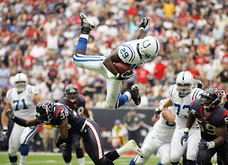
Thursday, October 11, 2007
9/11 Composition
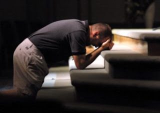
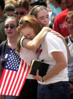 The curved positioning of the two people evens out the photo and does not leave anyone or anything left hanging or falling out of the frame.
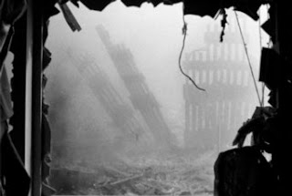
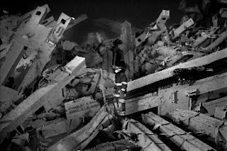 The diagonal lines of the remains of buildings are all coming toward the fireman. These lines lead the eye straight to him and make the photo dynamic. The lines make it really easy to see the main subject. The fireman is the center of the interest even theme he is standing in such a busy scene.
Avoiding Mergers
Tuesday, October 9, 2007
After Printing
Loaded Negative into enlarger- I took my negatives and put them in the holder with the negative I wanted to enlarge in the center. I put the holder back into place and pressed down the head of the enlarger.
Focused image- To focus the image that I chose I cranked the handle in the far back to get it to fit in the desired frame and then focused the image with the two knobs on the sides. To make sure that the image was perfectly focused, I used the microscope mirror thing to see the crystals in the image.
Set aperture- After I focused it, I changed the aperture to where there was a very dim light shining and i could barley see the image. I then turned off the light and set the timer to 3 seconds.
Made test strip- To make the test strip, I covered put a small piece of emulsion paper in the frame and shone light on it for 3 seconds, then i covered up 3/4 of the paper and shone it for 1 second. Then I covered only half of it up and shone light on it for one more second, and finally covered only 1/4 of the paper and shone light for 1 more second. I then ran it through the chemicals.
Made Final Print- I looked at my test strip in light and chose the amount of time that would work best for my image and went back into the dark room. I took a whole piece of emulsion paper put it in the frame and set the timer to the amount of time needed. I ran my paper through the chemicals and got my image.
Tuesday, October 2, 2007
Thursday, September 27, 2007
Negative Critique
Tuesday, September 25, 2007
Josten Contest
The Story
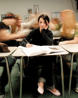 This photo tells the story of a school girl who must study hard and buckle down on her studies while eveyone else around her seems to be having a good time. She is still while everyone else is blurred due too constant motion.
Filling the Frame
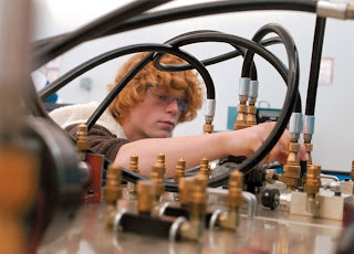
I like the way that the frame is filled in this photo because it is candid but the cables and knobs make it an interesting photo. Every inch of the frame is filled in an interesting way.
Sunday, September 23, 2007
Contest Photo

I find this photo inspiring because it is very simple but at the same time it expresses a strong feeling of relaxation and serenity. The reflection of the face, the blurred background, the angle that it is taken from, and the fact that it is in black and white really accent the softness of the photograph.
Saturday, September 8, 2007
Pinhole Photography
